
A while ago I needed a way to calculate colors. I wanted an easy way to get bright colors. I wanted it to be simple, taking a single hue parameter and mapping it into an RGB color.
The solution I found is to choose the red, blue and green channel values as overlapping trapezoids. The color is supposed to be cyclic, so I could used the fmod function in C++ or the % remainder operator in JavaScript. The result would transform any floating point argument into the base domain of\(\lbrack 0, 1)\).

The algorithm picks the values according to the above graph. As the hue argument moves from zero to 1, each color has a section where it is at its maximum value, part where it is zero. Between the two extremes is a linear transition. A zero value maps to zero in the corresponding RGB component while a 1 gets mapped to 255.
I’ve tried different curves for the transitions and the linear slope seemed to be the best compromise to make bright colors.
What I created is diagrammed here
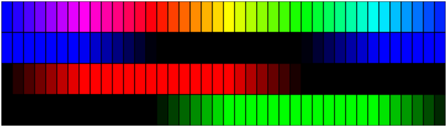
This shows the colors broken into the individual red, green and blue channels.
By changing the shape of the basis curves, different results can be obtained. This trapezoidal function was chosen in the end because it gives really bright colors and is simple to implement. (Also, I have a long-ago program that already uses this design and if I want to replicate it online, I need the same algorithm.)
The following code in JavaScript calculates the function.
var color = (function() {
    const coords = [ 0, 1, 1, 1, 0, 0, 0];
    const factor = 6;
    const red = 0;
    const green = 2/3;
    const blue = 1/3;

    function fromHue( hue ) {
        hue = ((hue % 1) + 1) % 1;
        const index = Math.floor( hue * factor );
        const fraction = hue * factor - index;

        return coords[index + 1] * fraction +
                        coords[index] * (1 - fraction);
    }

    return function( hue )
    {
        let r = Math.round( 255 * fromHue( hue + red ) );
        let g = Math.round( 255 * fromHue( hue + green ) );
        let b = Math.round( 255 * fromHue( hue + blue ) );
        if( r !== r || g !== g || b !== b ) {
             r = g = b = 0;
        }

        return `rgb(${r},${g},${b})`;
    }
})( );
The coords array specifies the function’s value at each of the evenly spaced corners. The seventh value matches the first so that the curve is cyclic. Each hue that is not at a vertex will be a linear interpolation of the two quantities to the left and right. You can verify the values in the coords array by reading the red graph at the marked points on the hue axis. The coords table adds flexibility because different coords array and adjusting “factor” to match it can create other spectra.
Each color is out of phase by 1/3, Thus adding 1/3 and 2/3 to the hue will shift the graph so that the same trapezoidal curve can be used for each of the red, green and blue channels. Blue is 1/3 rather than green because if you shift the blue graph to the right by 1/3, it lines up with the red graph while green must shift right by 2/3 to match.
Inside the fromHue( ) function, the “((hue % 1) + 1) % 1” expression looks peculiar. The % operator returns the remainder of a division. For positive hue, the remainder of dividing by 1 is the fractional part. If hue is negative, the remainder will negative, between -1 and 0. Adding 1 and then calculating the remainder of that will map the entire domain for each color channel to the range [0, 1) without needing an “if.” By mapping hues into that range of 0 to 1, it is as if the above diagram repeats indefinitely to the left and right along the hue axis.
The Math.floor() operation takes a hue times six and converts it into an integer index for the coords array. By multiplying by 6, the corner points have integer indices and the fractional part left by subtracting index can be used to do the interpolation.
In the return statement of fromHue( ), “index + 1” accesses the value of the function to the right of the calculated fraction. Since the points of the coords array are 1 apart, the slope is \(coords\lbrack index + 1\rbrack – coords\lbrack index\rbrack\)
In point slope form, the value is
$$coords\lbrack index\rbrack + (coords\lbrack index +1\rbrack – coords\lbrack index \rbrack ) * fraction$$
Combining the two references to \(coords\lbrack index \rbrack\) results in the expression above.
After calling fromHue(), the calls to Math.round( ) take each component and map it to an integer from 0 to 255. The text that it returns is appropriate for using for the color in styles and graphic contexts.
The final “if” statement detects when the results are NaN and replaces that with black. NaN is the only value that is not equal to itself. Whenever the argument hue is not a number, fromHue( ) will return NaN.
For example, if hue were 1.6, for Red, the first expression would replace hue with 0.6. Then, index would be Math.floor( 6 * 0.6 ); or floor( 3.6) or 3. Fraction would be 0.6. Coords[ 3 ] is 1 and coords[4] is 0. The result then is 0 * 0.6 + 1 * (1 – 0.6) which evaluates to 0.4. Then, red would be set to Math.round(255 * 0.4) which is 102. For Green, fromHue would be given about 2.267 which changes to 0.267 when you take the remainder. Index would be Math.floor( 6 * 0.267 ) or floor( 1.6 ) or 1. Coords[1] and coords[2] are both 1 so the return statement would return 1. This would then become 255. For Blue, fromHue would be given about 1.933 which would become 0.933. This leads to an index of 5 and fraction of 0.6. Coords[ 5 ] and coords[ 6] are both 0 so blue would be 0. Since none of these are NaN, the result would be the string “rgb(102,255,0)”
Because the corners in the trapezoidal shapes are positioned at constant intervals, the algebra is simplified. Without a repeating shape or with unevenly spaced key points, the algorithm would need an inelegant sequence of ifs to calculate the curves.